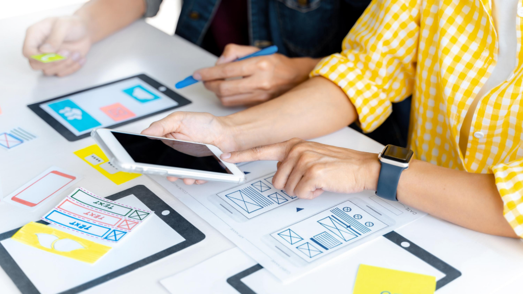
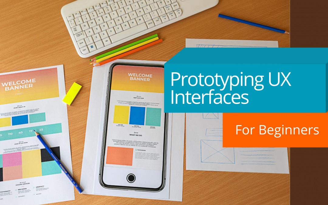
It’s practically impossible to devise a good UX interface without first prototyping what you expect to accomplish with your design. Prototyping is an integral step in ensuring you are delivering the required functionality and ease of use in your product. It sets expectations with your audience and clearly defines requirements. It allows for free exploration of ideas without having to spend weeks of development to glimpse the end result. Basically, if you don’t prototype, your risk for creating something not nearly as helpful or easy to use increases exponentially. So where do you start?
The Idea Vomit Phase

Here’s an exercise to get those creative juices flowing. Get out a blank piece of paper (or 5 or 10, whatever works). Set a timer for 5 minutes. In your 5 minutes, start sketching whatever comes to mind as it comes up. Don’t try to discriminate against your ideas as bad or good before they have a chance to come out. Even if you think the first thing you thought of was dumb, draw it out. Also, nothing has to be perfect. Your boxes don’t need to be perfect little boxes. As long as you understand what you drew on the page, that is what matters.
The Group Pow Wow Phase

Now that you have a collection of ideas, it’s time to polish those out with some group think action. The best way is to get a small group together (no more than 3 people) to do some whiteboard-ing. Keep in mind that emotions can run high. Us humans can get very attached to ideas. And if someone disagrees with you it can sometimes feel like a personal attack. I’d say the vast majority of the time it is, in fact, NOT a personal attack.
Anecdote time: once I threw a marker at a coworker for shooting down one of my ideas. To me his responses sounded sarcastic and flippant. I got angry. Then threw a marker. Pro tip, don’t throw markers at your coworkers. It all worked out since we were friends. But can you imagine if that was your boss???

Anyways, back to business. What is whiteboard-ing you ask? Well, you start sketching out your ideas on a whiteboard. This is a great forum because it is easy to erase and modify your designs quickly. You can also use different colors to signal functionality. And, you can always hand the marker over to another so they can contribute to the design right then and there! Then, at the end of your little pow wow, take a photo of your work together for reference later.
The Actual Prototype Phase

Now you’ve got your ideas polished a little and enriched with some additional contributions from your team. It’s time to see what your design might actually turn out to be!
Pick a tool.
There are a few tools specifically for UX design that are relatively easy to use.
- Adobe XD (free)
- Origami Studio (free)
- Balsamiq ($12/month)
There are plenty more I haven’t mentioned, but these are the most affordable.
If learning a new tool or access to the above is difficult, you can always use PowerPoint or Keynote. To be honest, PowerPoint is plenty good enough to get your point across without the learning curve of a new tool. I have used it many a time and everyone was quite pleased with the results. If you decide to use PowerPoint, take advantage of the shapes native in the tool. Also, feel free to copy images off the web for your prototype. It just takes too long to create a custom image when all you want to do is communicate future functionality and aesthetics. Just avoid using the copied images in your final product design for copyright purposes.
Prototyping is an iterative process.

You’re probably not going to get the design spot on the first time. If you did, I would be concerned. Your first iteration shouldn’t be too colorful. You first want to prototype out the functionality. Once you’ve pretty much figured out what you want your product to do and how it is going to do it, you can add in the fun graphic design stuff such as color, font, graphics, and placement.
The Feedback Phase

It’s hard to really put this phase in any sort of linear progression. Ultimately, your whole design process will be in the feedback phase. But if you want a clean, nice functioning design, you need to put it in front of people and see how they react. Don’t give them directions, just let it flow. If they struggle with a certain aspect of your design, take it into account. How can you ease their struggle? Was it a cognitive error? Did they assume something they shouldn’t have? Feedback doesn’t always need to be explicitly given. Sometimes, how a person interacts with a tool can give you more insight into the design failings than anything someone could actually tell you.
Prototyping is truly imperative in any excellent design’s evolution. It sets the groundwork for the actual development. It helps you understand what your audience needs, not just what they want. And, it gives your audience something to look forward to while you put in the effort to actually build your design.
Put the knowledge to use!
Now go forth and get your design on! Also, I’d love to hear your thoughts or suggestions in the comments below. You can also send me an email directly at saebylmcdoulett@findingthebeat.com.

